work about resume linkedin
Health app
Increasing financial health literacy by guiding preventative care
client
Highmark Health
team
UX designers
my role
Design lead
timeline
Jan - Aug 2020
overview
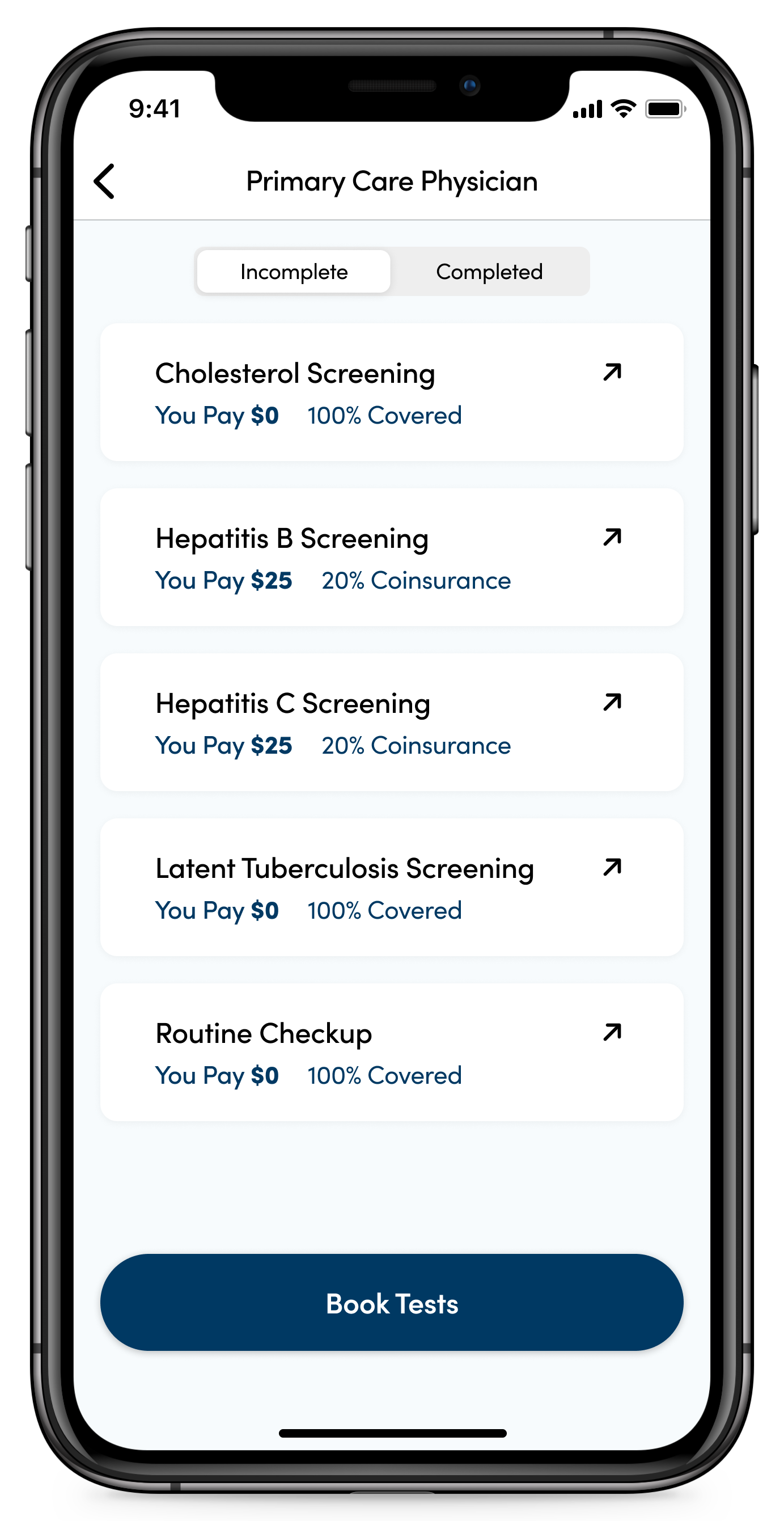
A mobile app as a guide to preventive care, offering a recommended list of tests and screenings to get throughout members’ lives. This platform is a step towards establishing a solid relationship of trust between Highmark and its members, opening up more opportunities for members to interact with Highmark and to ultimately increase their financial health literacy.

research
Given the problem of low financial health literacy, we conducted interviews with members, employers, and medical service providers and sent out surveys to better understand members’ current experience with health insurance and the roles of stakeholders.
Insight #1
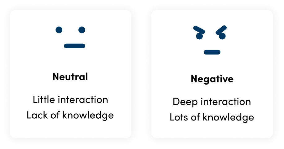
Two types of members
Insight #2
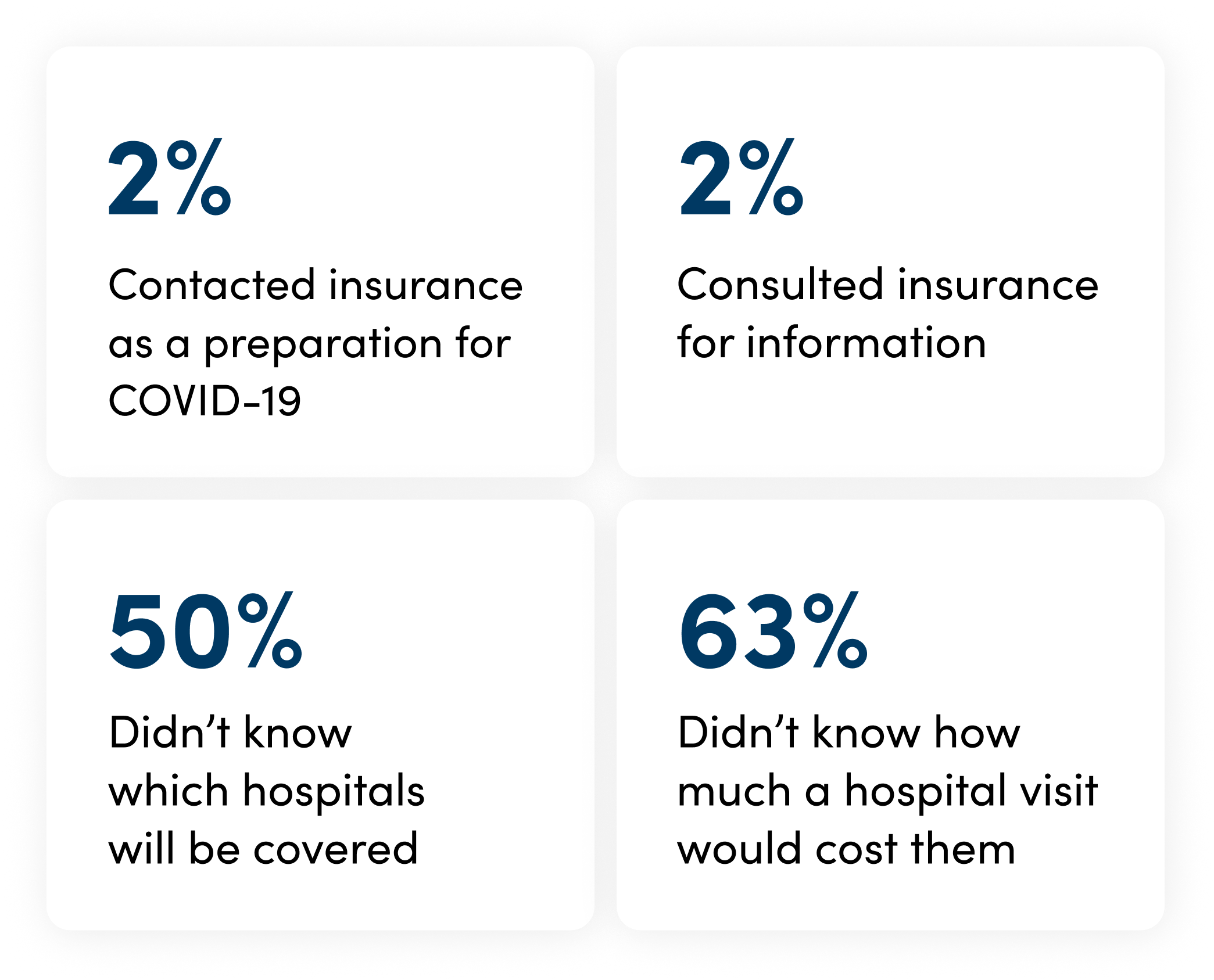
Narrow window of opportunity for interaction
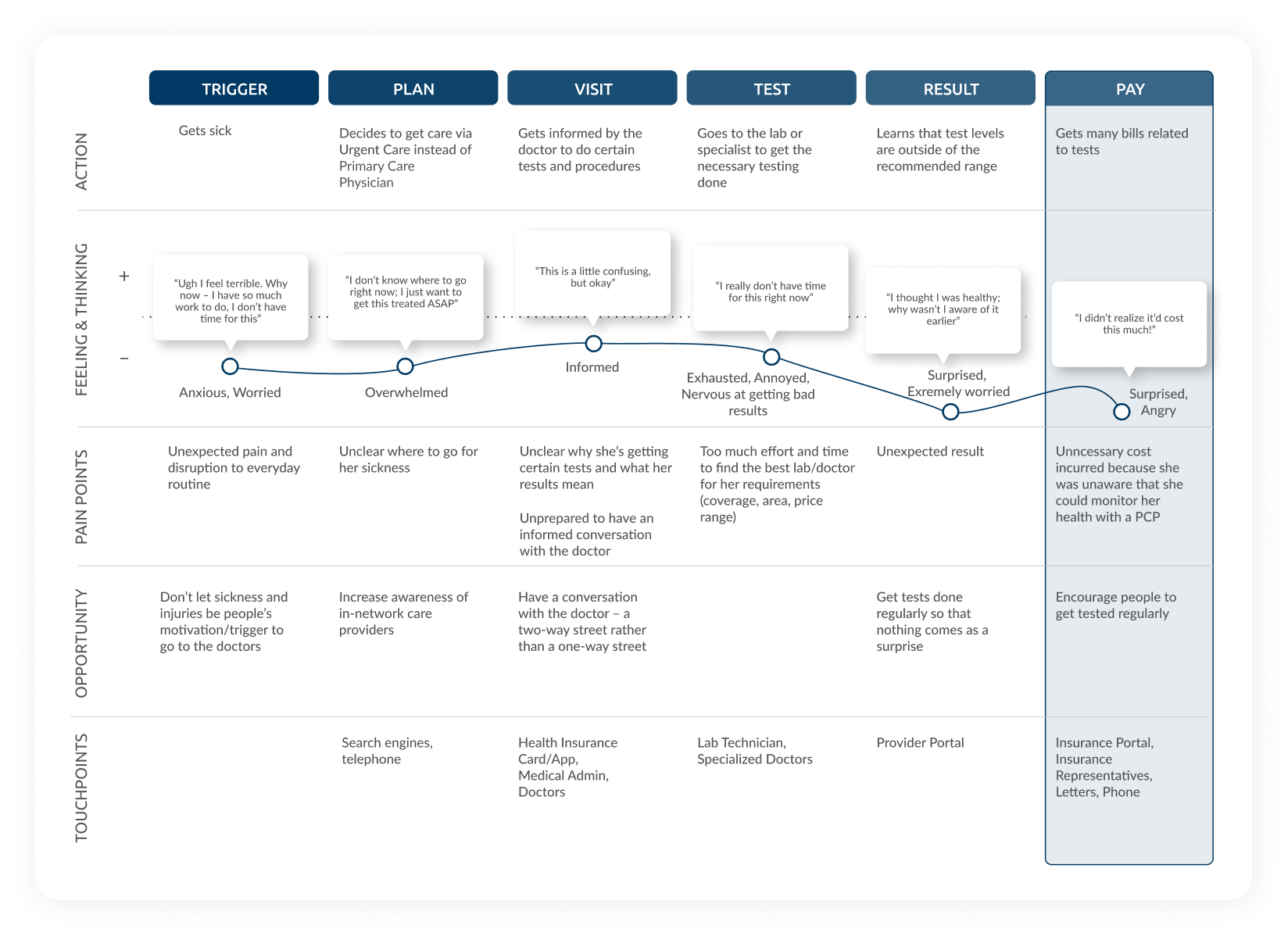
Insight #3
Lack of trust in health insurance
opportunity
Before we start throwing tools to improve their financial health literacy, we first had to solidify this foundation. Because, without this basis, anything built on top of it was bound to fail.
What leads to trust?
How might we give members control to manage health and cost?
ideation
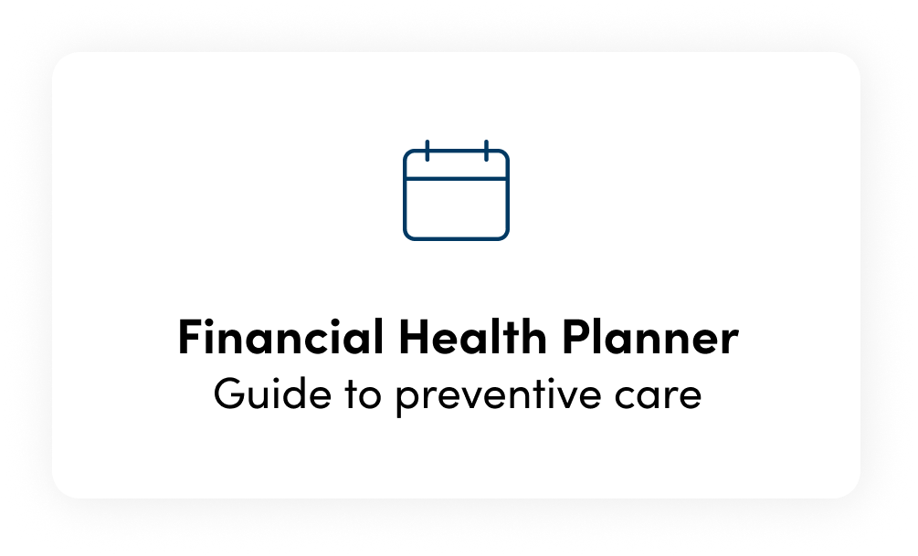
Through concept validation testings to give members control, we decided to move forward with Financial Health Planner– a mobile platform that provides members with a recommended list of preventive tests and screenings for the year – for working adults in their 30s.
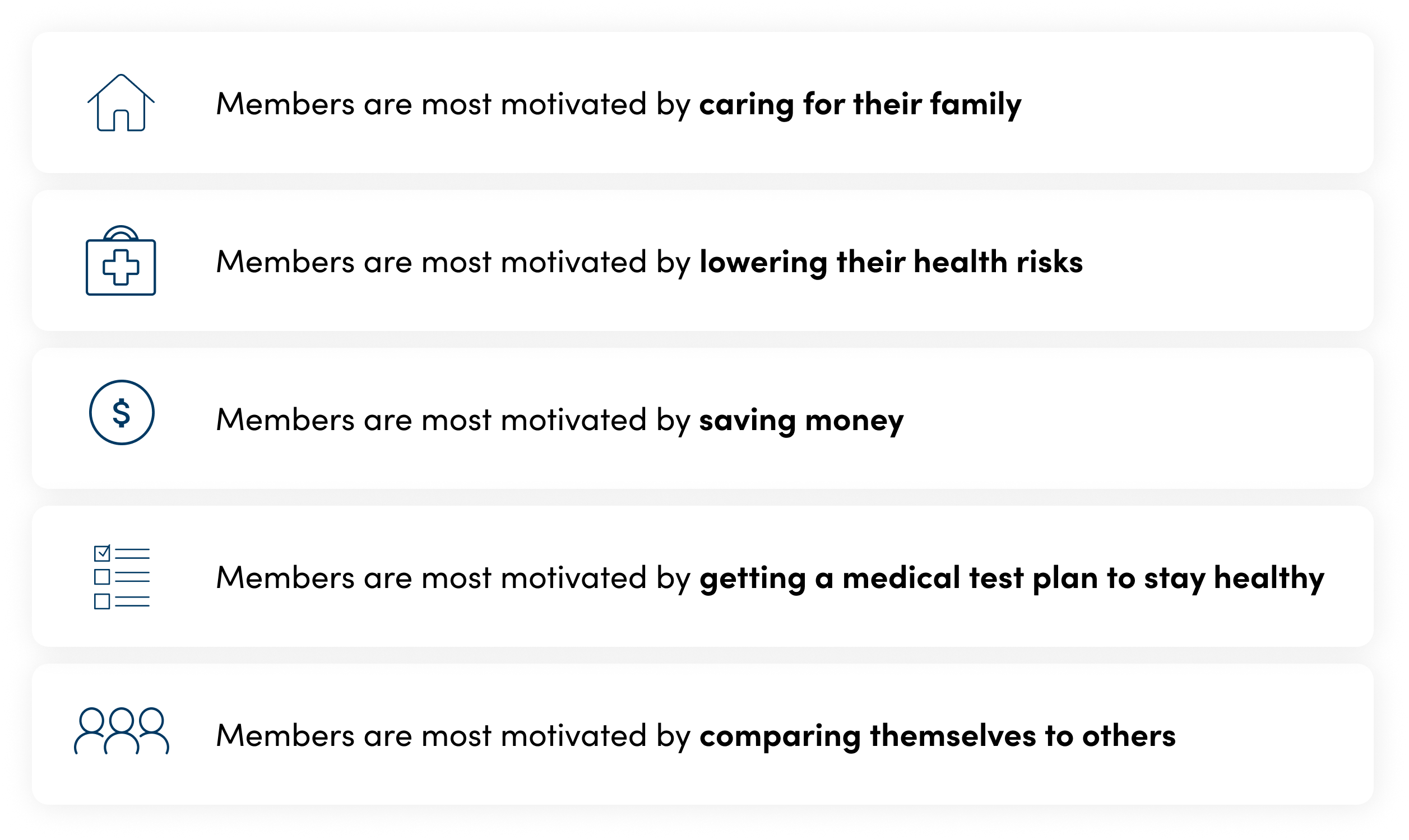
Why Financial Health Planner?
testing
To endorse behavior change of getting regular checkups, we prototyped features that reflect each motivation hypothesis, tested them with users, and conducted secondary research into behavioral design.
Features hypotheses
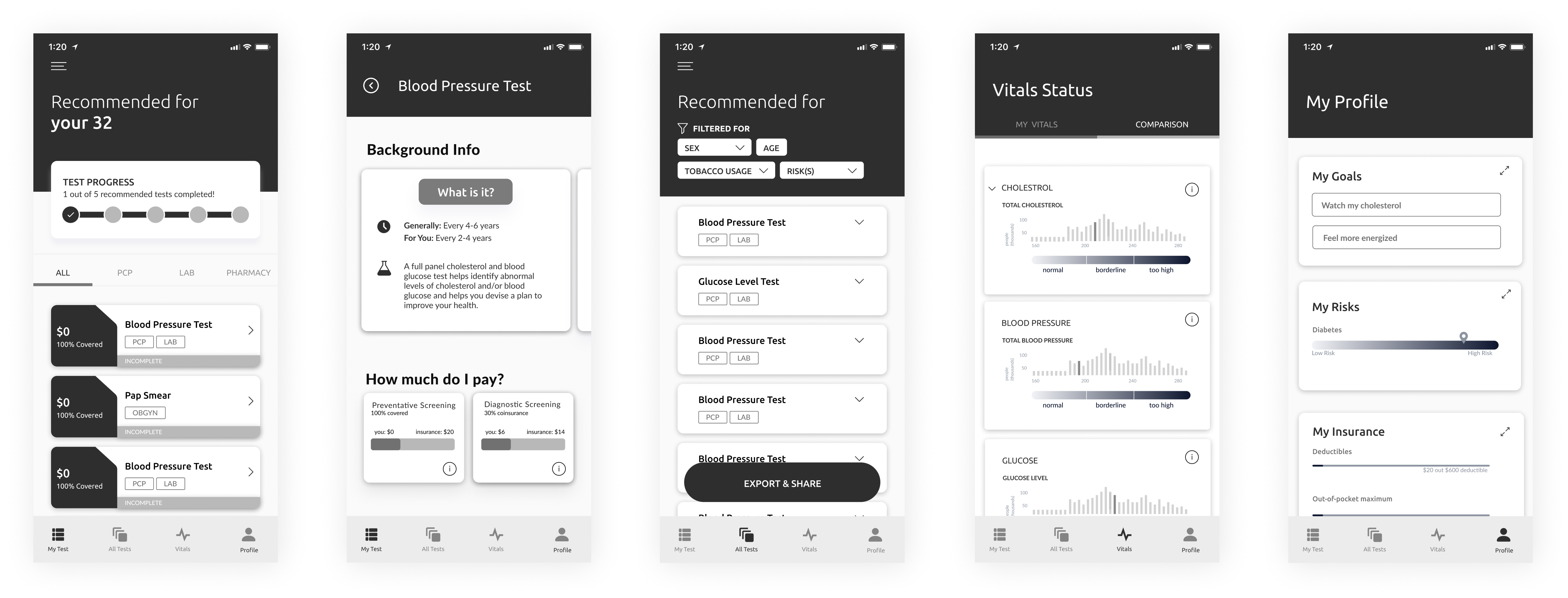
Mid-fi prototype
Iteration

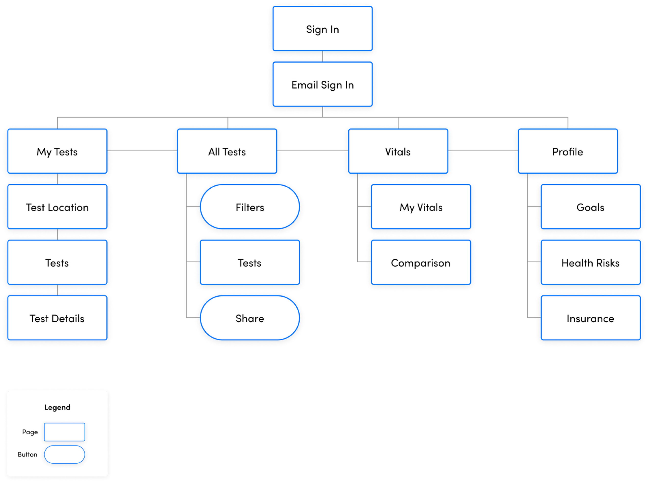
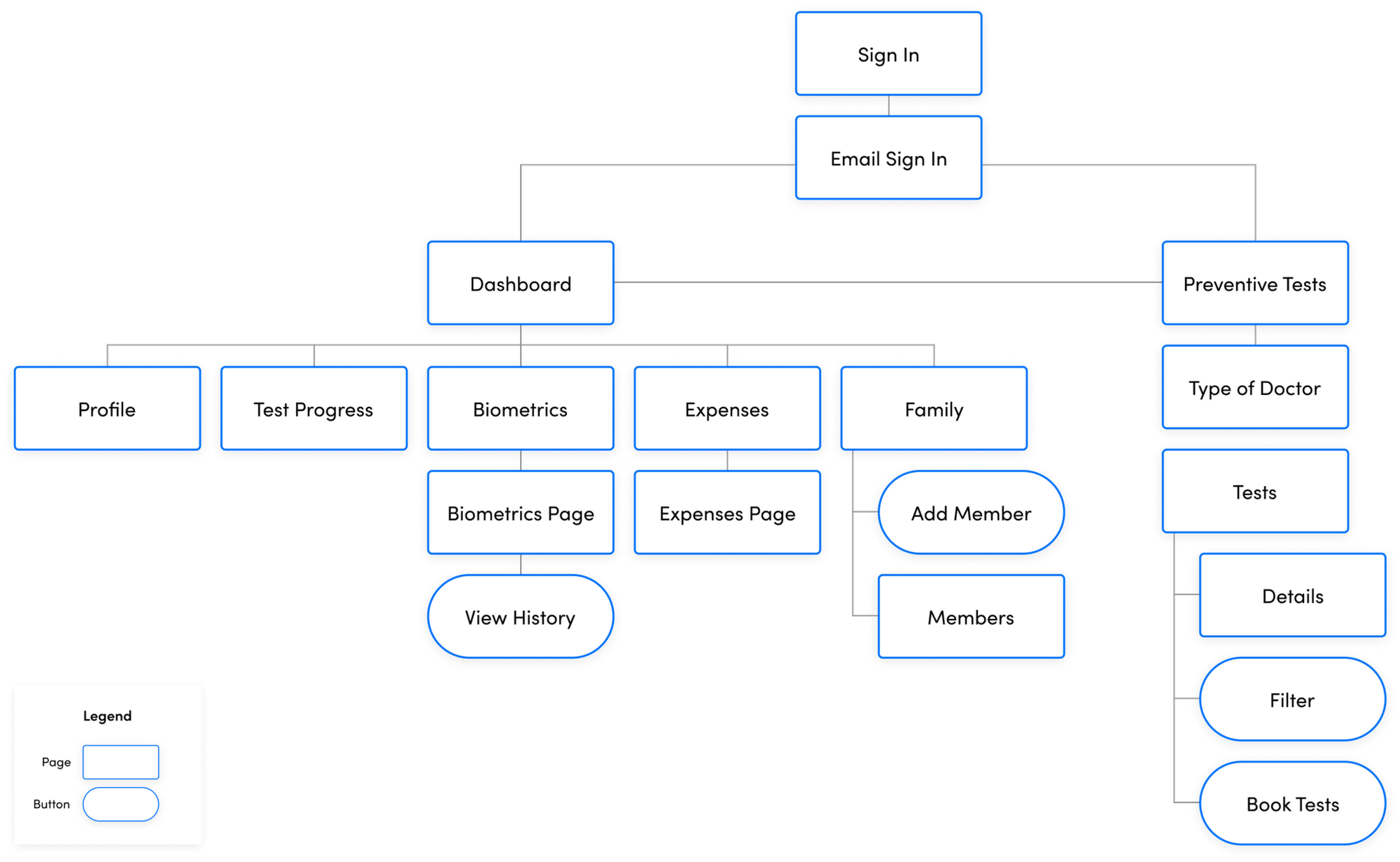
Through usability testings via usertesting.com, we found that navigation was a big issue as it made the app feel scattered and not cohesive. We revamped the information architecture from a 4-tab navigation to 2-tab navigation, regrouping relevant information to better fit users’ mental model.

design system
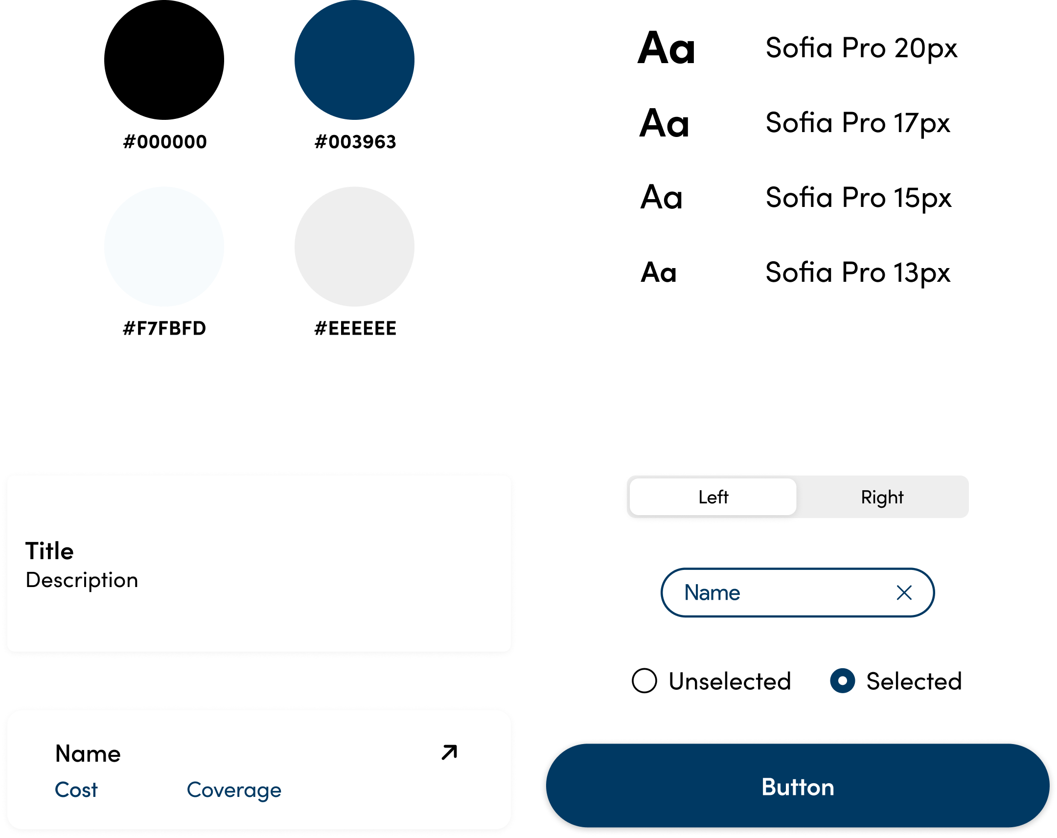
As we moved into hi-fi, I helped organize the team’s process by setting the design system.
final design
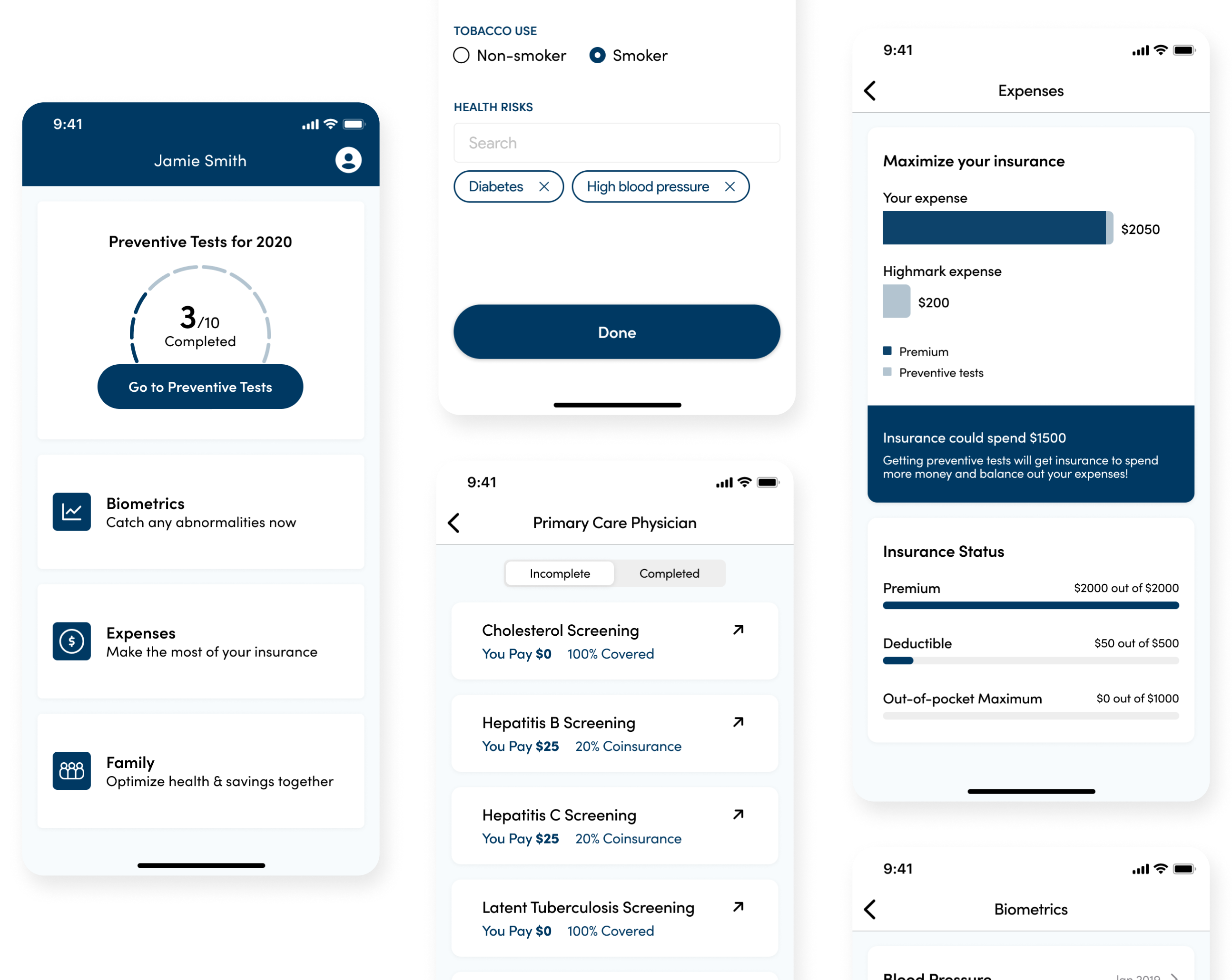
Simple navigation

Data about your tests, health, finances, and family all in one place
Test details

Know the care you need, including why you need it
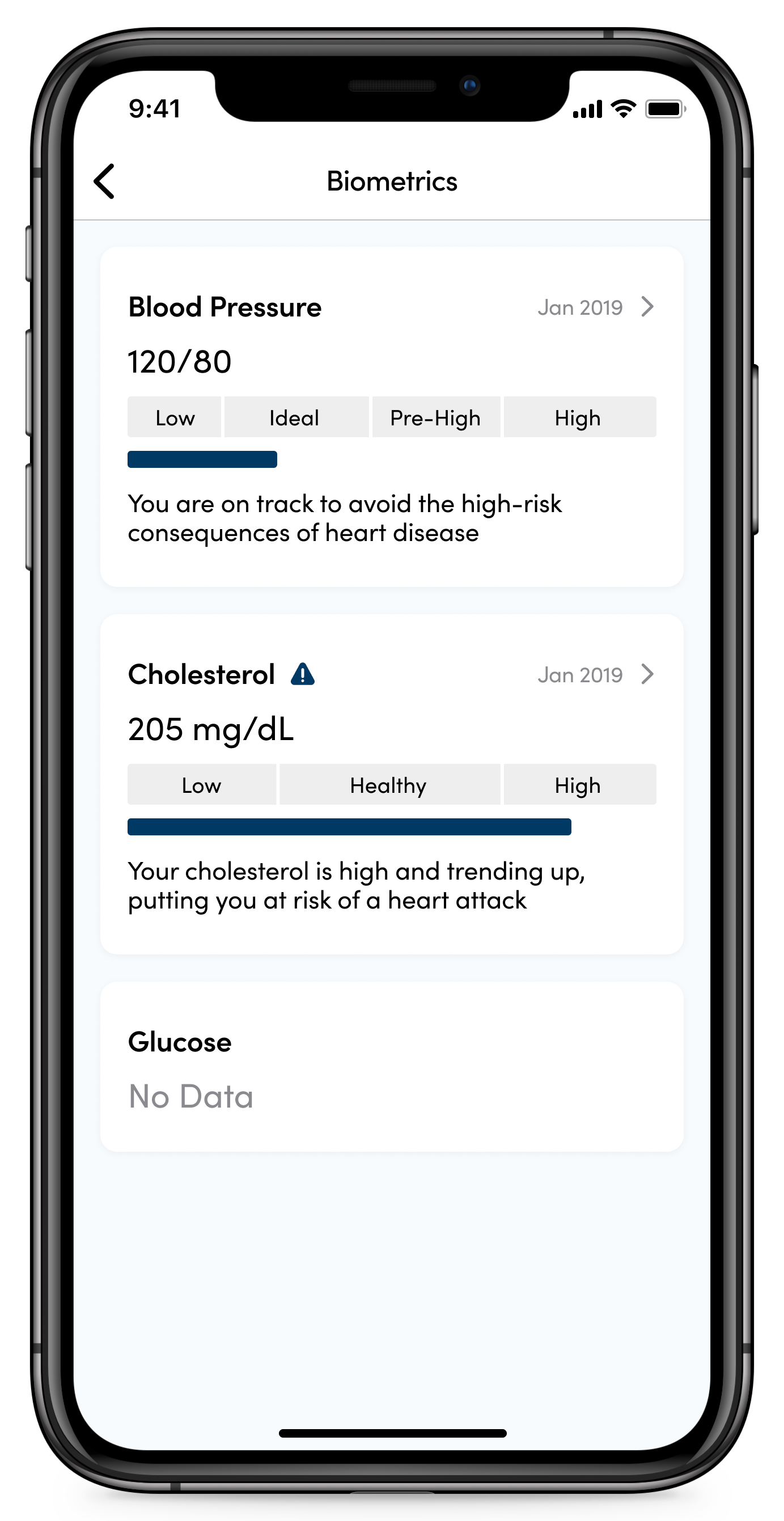
Biometrics

Track you health by seeing the results of those tests readily available within meaningful context
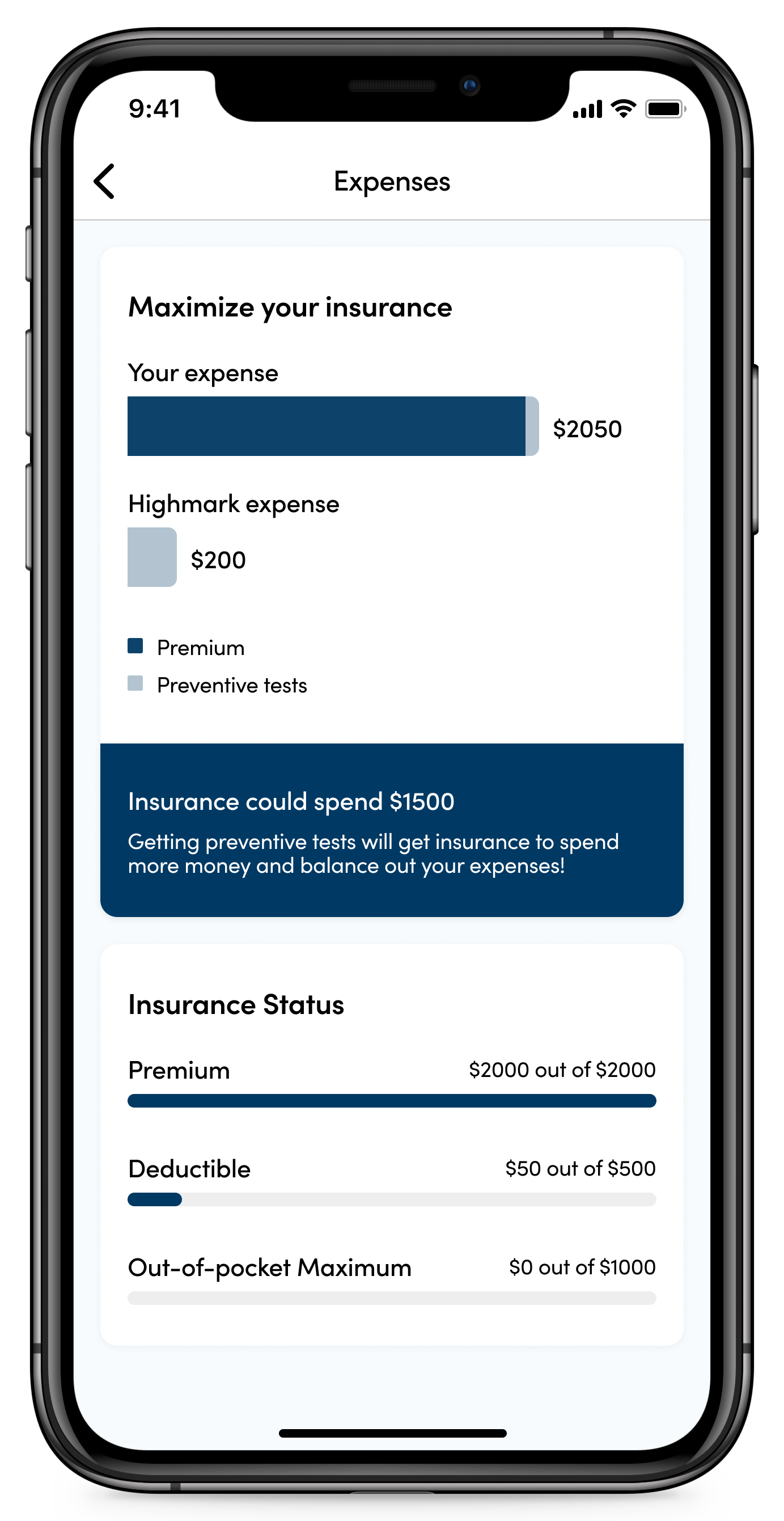
Expenses

Make the best use of your insurance while also understanding how cost of care is impacted by variables like deductible statuse
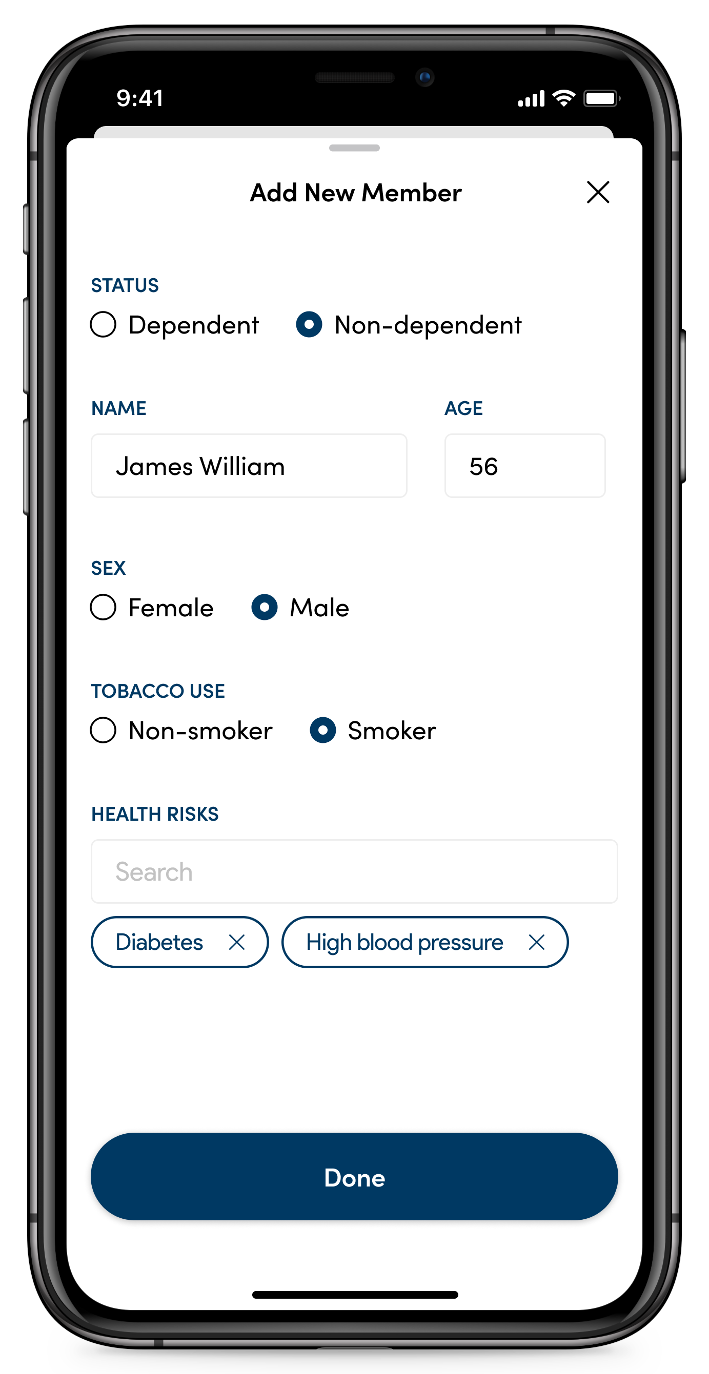
Family

Take care of your loved ones by accessing their recommended list of care
reflection
1. I'd measure success by: decrease in number of diagnostic care for chronic illnesses, increase in adoption rate of other services offered by Highmark, and decrease in calls regarding dispute claims and coverage questions

2. Being responsible and respectful is the key to teamwork

3. Be crazy and fly with it 🦋

data ingestion health app venmo case study